Feeling stuck staring at your Instagram profile, wondering if your bio really matters in 2026? You’re not alone!
With over 3 billion monthly active users on Instagram, it’s a bustling digital space where first impressions count more than ever before.
But here’s the major issue!
Many people either rush through their bio or treat it like an afterthought, and miss out on real opportunities to connect, convert, and stand out.
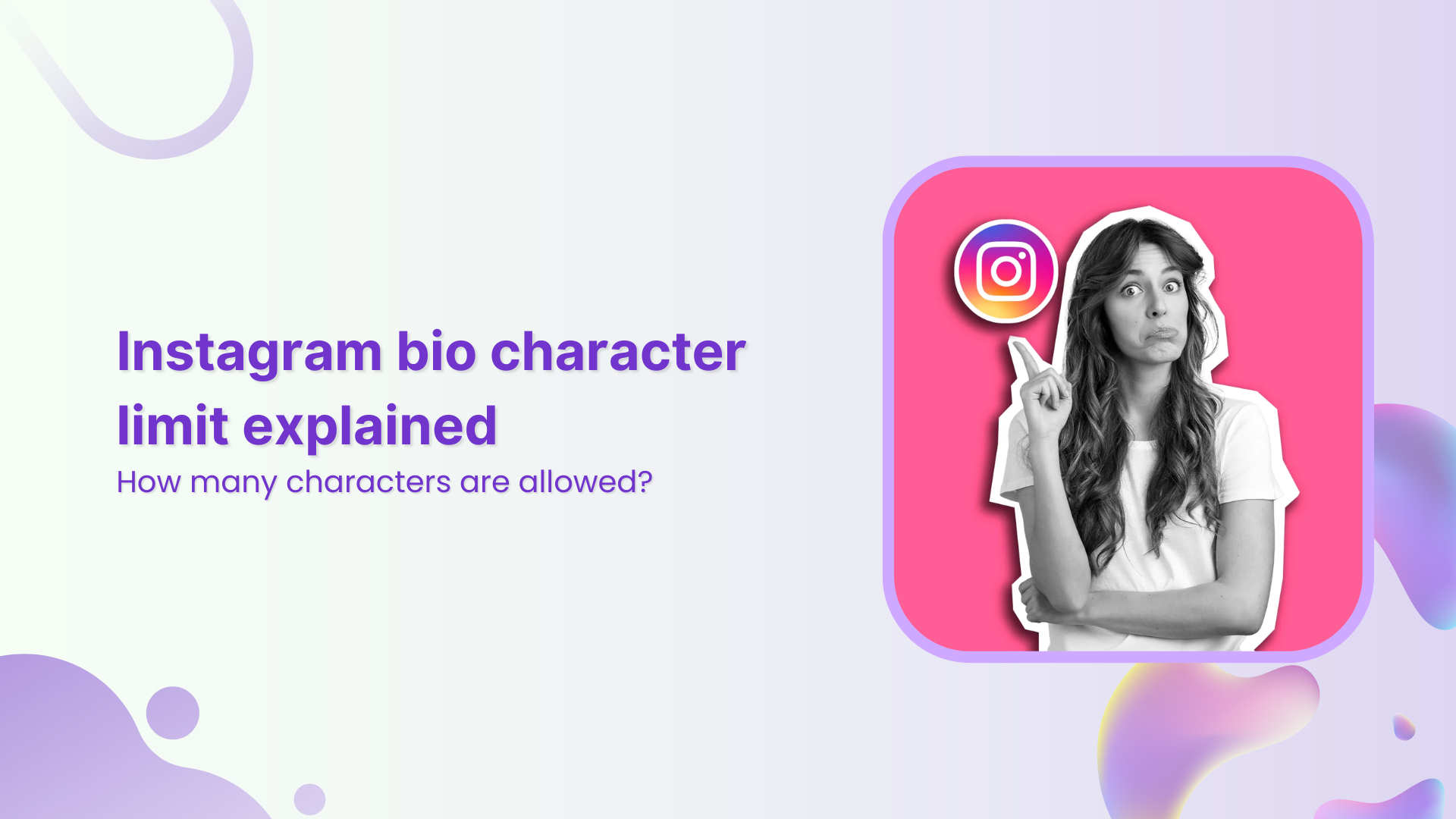
This is especially true if you’re crafting a professional bio that needs to communicate who you are, what you do, and why people should care, all within 150 tiny characters.
It’s frustrating when you know your content is great, yet your profile doesn’t reflect that at a glance.
Luckily, updating your Instagram bio is easier than you think, and that’s exactly what we’ll walk you through next.
So, stay with us for the next couple of minutes!
What is the bio section on Instagram?
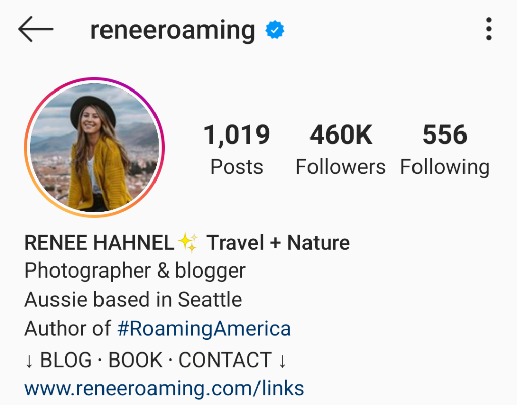
Your “Instagram bio” is that short bit of text right under your username and profile photo on your profile.
Think of it as a tiny intro card that tells new visitors who you are, what you do, or what they can expect from your account, all in one short sentence or two.
Even with only a small space, it’s one of the first things people see when they land on your profile.
How does it work:
- Quick snapshot of you: It’s a brief section where you can introduce yourself, share your vibe, or even explain your business (basically your mini pitch to anyone who lands on your profile).
- Character limit: You only get up to 150 characters, so every word has to count. That’s why it’s important to keep it clear and punchy.
- Extras you can add: Beyond simple text, you can include emojis, hashtags, or even mentions of other profiles to make the bio more engaging and searchable.
- Clickable link: Instagram lets you add one main link in your bio. That’s super helpful if you want to send people to your website, blog, shop, or even a link page with lots of options.
- Visible everywhere: Anyone who visits your profile (whether on mobile or desktop) will see your bio right away, so it works as a quick intro that sets expectations for your content.
How to change bio on Instagram on iPhone
Updating or editing your Instagram bio on your iPhone is actually really straightforward. You just need to know where to go and what to tap.
No matter if you’re refreshing your vibe, adding new info, or tweaking your professional or personal short bio, these steps will make sure you do it in a few taps without the usual headaches.
Here’s how to change bio on Instagram app on an iPhone:
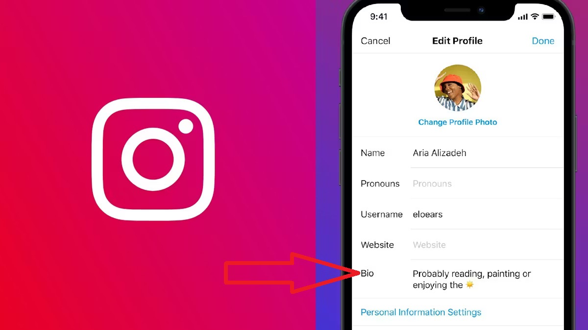
1. Open the Instagram app: Find and tap the Instagram app icon on your iPhone and make sure you’re logged into your account.
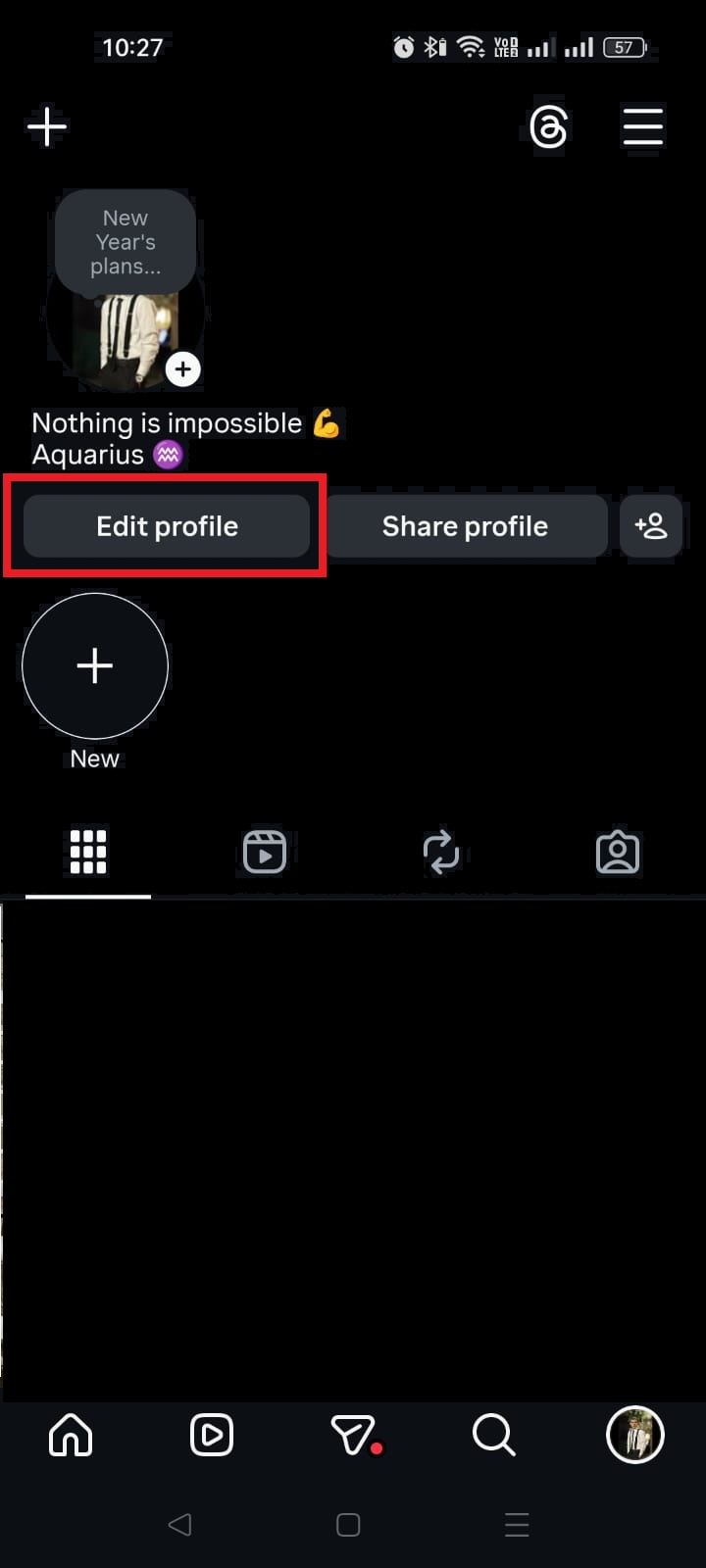
2. Go to your profile: Tap the profile icon at the bottom-right of the screen. That’s you!
3. Tap “Edit Profile”: Right under your profile picture and username, you’ll see Edit Profile. Tap it to open your profile settings.
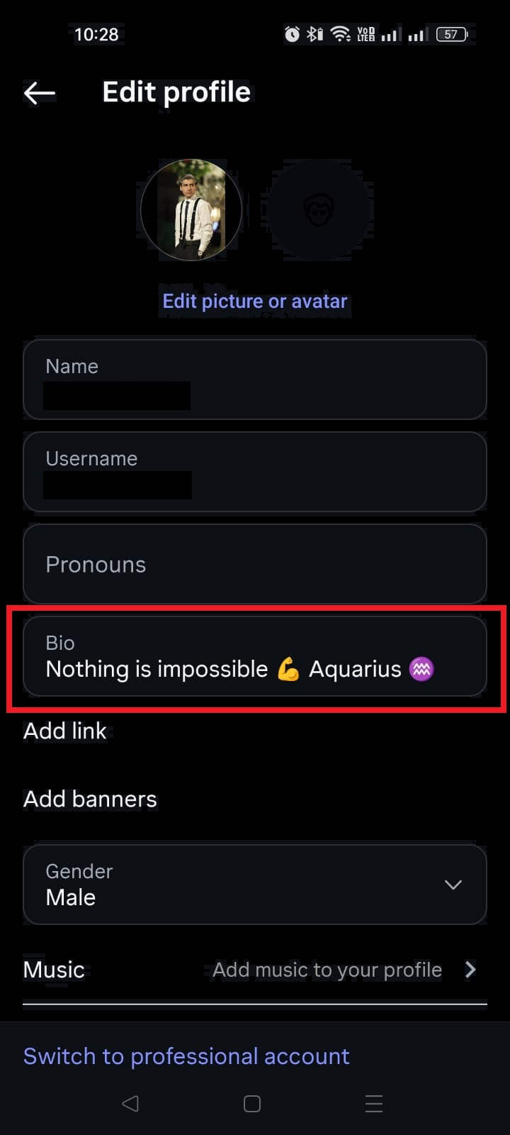
4. Select the “Bio” field: In the profile settings, find the Bio section. Tap on it to start editing the text.
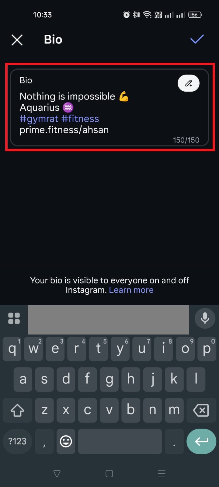
5. Type your new bio: Add, delete, or rewrite your bio the way you like. You can include emojis, hashtags, or a link, but keep it within the 150-character limit Instagram gives you.
6. Save your changes: Once you’re happy with it, tap Done (or the checkmark) in the top-right corner to update your bio. It’ll show up instantly on your profile.
That’s it! You’ve just changed your Instagram bio on your iPhone, successfully 🎉
Now your profile says exactly what you want it to!
Note: If you don’t see the Done(or the checkmark) icon, sometimes just tapping outside the text box or waiting a second for your keyboard to settle makes it appear.
How to change bio on Instagram on an Android smartphone
Changing your Instagram bio on an Android phone takes just a few taps, and it’s basically the same process as on other phones; it’s just about knowing where to go.
Whether you want to freshen up your profile, add a new tagline, or make your bio actually say what you mean, this guide walks you through it step-by-step so you don’t miss anything.
Here’s how to change bio on Instagram mobile (Android):
1. Open the Instagram app: Tap the Instagram icon on your Android phone and make sure you’re logged in.
2. Go to your profile: Tap the profile icon (usually a little person silhouette) at the bottom-right to open your profile page.
3. Tap “Edit profile”: Just below your profile picture and bio, you’ll see the Edit profile button. Tap it to enter the edit screen.
4. Tap the “Bio” field: Look for the Bio box on that screen and tap it. The existing bio will become editable.
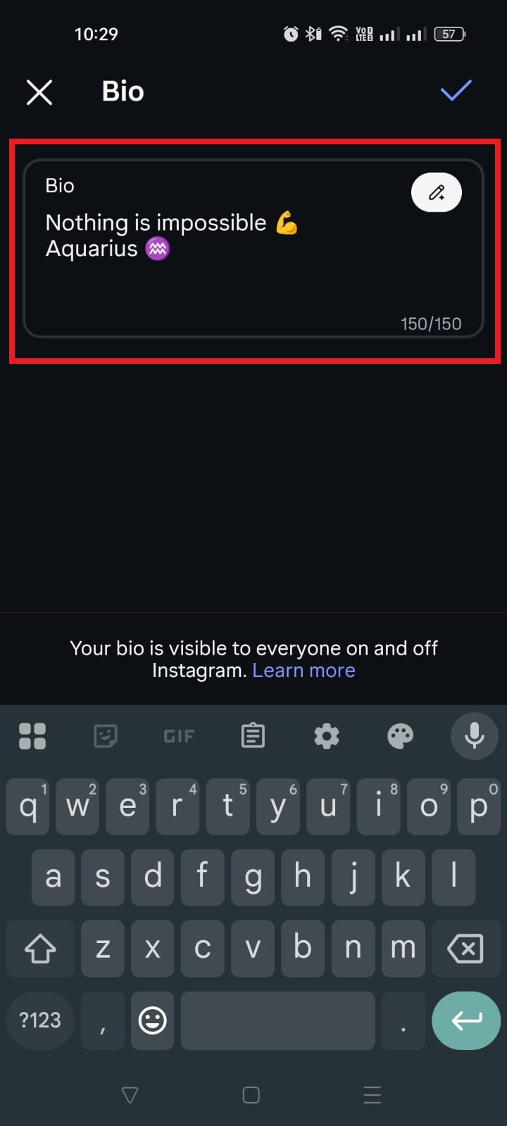
5. Type your new bio: Enter whatever you want your bio to say. You can include emojis, short links, or hashtags. Just stay within Instagram’s 150-character limit.
6. Save your changes: Hit the checkmark (✓) in the top-right corner to save. Your updated bio will appear immediately on your profile.
That’s it, super simple and quick!
Now your profile reflects exactly what you want visitors to see.
How to change bio on Instagram on desktop (web browser)
Updating your Instagram bio from your computer (PC) is handy, especially when you’re working, blogging, or just want the bigger keyboard advantage.
The web version of Instagram lets you edit your profile, including your bio, right from your browser with just a few simple steps. (no phone needed!)
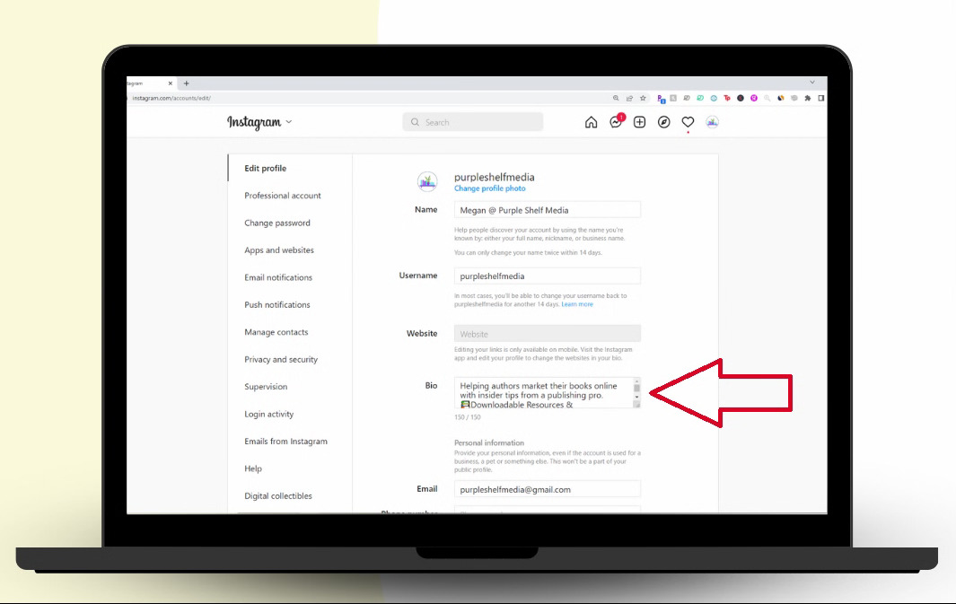
Here’s how to change bio on Instagram profile on desktop/laptop:
1. Open your web browser: Go to instagram.com and log in to your account if you haven’t already.
2. Go to your profile: Click on your profile picture or the profile icon in the top-right corner, and select Profile from the menu.
3. Click “Edit profile”: On your profile page, you’ll see an Edit profile button near your username. Click it to open the editing screen.
4. Find the “Bio” field: In the edit screen, look for the Bio box. Click inside it to select it, then delete the old text and type your new bio. (Remember, Instagram limits this to about 150 characters, including spaces and emojis.)
5. Save your changes: Once you’re completely satisfied with what you’ve written, click Submit at the bottom of the form to save the new bio. It will update on your profile right away!
And that’s all there is to it!
Quick tip: If your bio doesn’t seem to save properly from the web, try refreshing the page or clearing your browser cache (sometimes tiny glitches happen).
How to change bio on Instagram business account
Changing your Instagram bio on a business account works almost the same as on a regular personal profile. The only difference is that business accounts often have a few extra options (like contact buttons and address fields) that you can fill in if you want.
The steps below will walk you through it cleanly so you don’t get stuck.

Here’s how to do it:
1. Open the Instagram app: Launch Instagram on your phone and make sure you’re logged into your business account.
2. Go to your profile: Tap your profile picture icon at the bottom-right of the screen to head over to your profile.
3. Tap “Edit profile”: Right under your username and bio area, you’ll see Edit profile. Tap that to open your profile settings.
4. Find the “Bio” field: On the Edit profile screen, you’ll see a box labelled Bio. Tap inside that box to start editing your text.
5. Type your new bio: Enter the text you wish! For business accounts, it’s a good idea to include your value proposition or a short brand message, so people instantly know what you offer. You can use emojis and hashtags too (but use them sparingly).
6. Add contact details (optional): In a business account, you may also see extra fields like Business Address, Phone Number, and Email. These aren’t technically part of the bio box, but they show up on your profile and make it easier for customers to contact you.
7. Save your changes: Once you’re delighted with how your bio looks, tap the checkmark (or Save/Done) at the top-right. Your updated bio will appear right away on your profile.
And that’s it! You’ve successfully refreshed your business bio without any fuss! 🎉
Note: No matter if you’re updating your brand message or adding a new promo link, keeping your bio current helps people quickly understand your business.
Why one must focus on his/her Instagram bio in 2026
In 2026, your Instagram bio isn’t just a few lines of text anymore; it’s your first handshake with anyone who lands on your profile.
With Instagram still featuring a massive global user base and high engagement compared to many other platforms, people form an impression of you or your brand in just a few seconds, and your bio plays a big part in that.
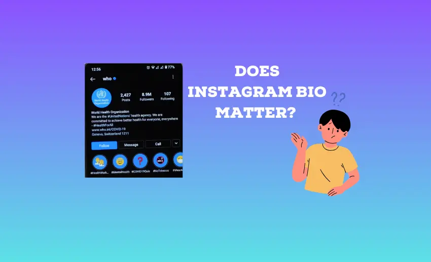
A clear, well-written bio tells visitors instantly who you are, what you do, and why they should care, which can be the difference between losing a potential follower and gaining one.
Moreover, a strong bio also helps people find you, because Instagram’s search and explore suggestions use keywords from bios to recommend profiles to others.
In short, it’s a tiny space with big impact, helping boost visibility, trust, and engagement right from the start. So, please make the most of it!
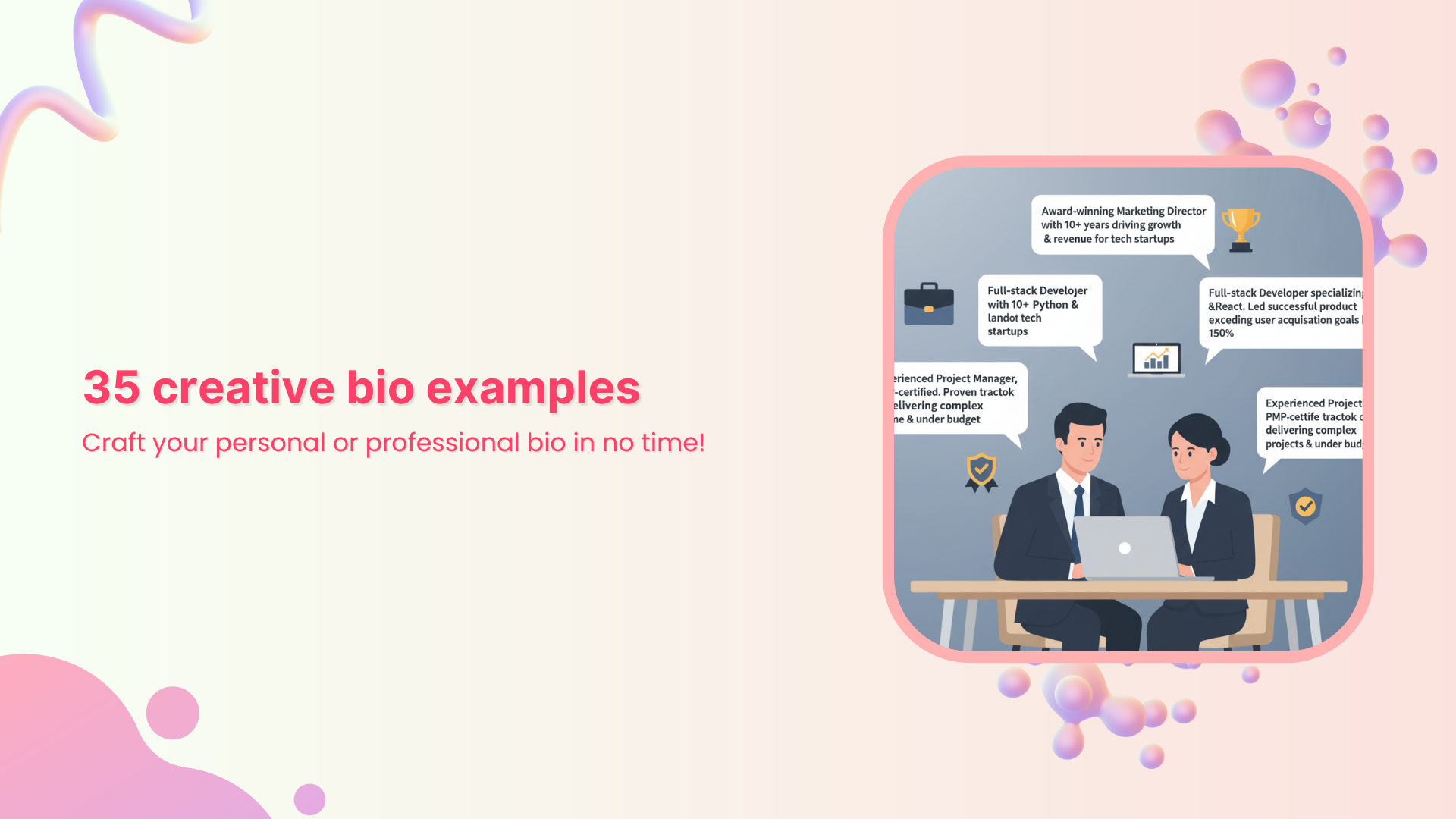
How to write a great Instagram profile bio: 8 useful tips
Your Instagram bio is where you make that first impression, and in 2026, it still matters more than ever.
A great bio doesn’t just look good, it tells people what you’re about, helps them find you, and maybe even gets them to take action.
Here are some practical tips to help you craft one that actually works!
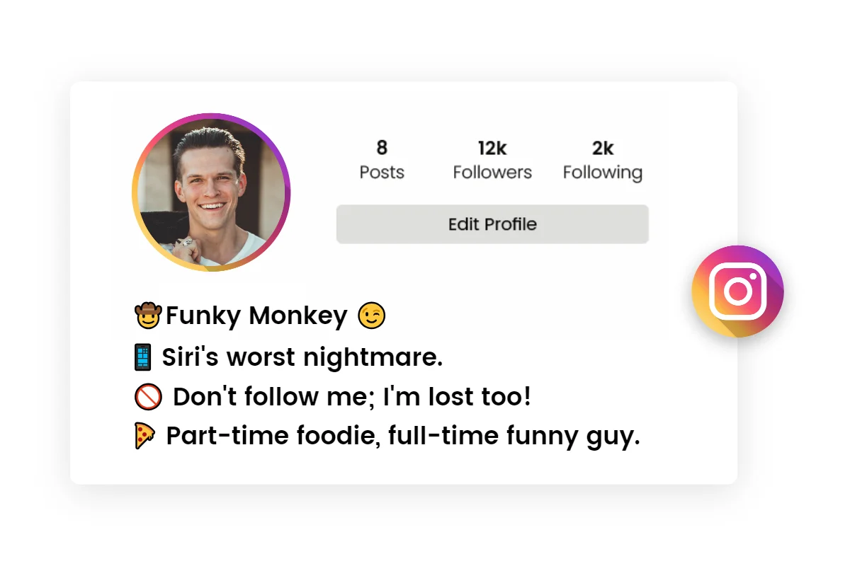
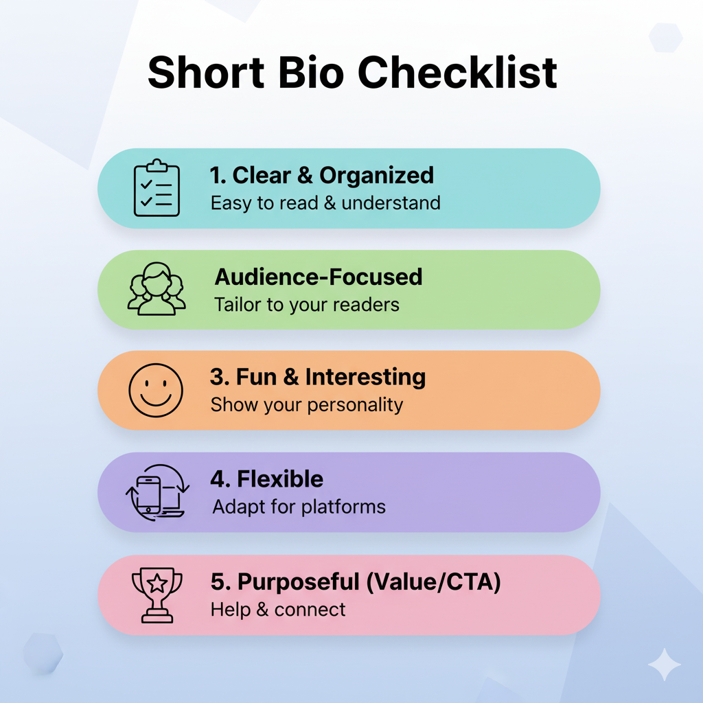
Tip #01: Keep it concise, memorable, informative, & structured
Instagram only lets you use up to 150 characters, so remember that every word counts. Keep it short, clear, and easy to scan (use multiple lines) so your visitors instantly get what you’re all about.
Tip #02: Define your purpose
Tell people why you’re on Instagram, whether you’re sharing travel tips, selling products, or posting creative work. A clear purpose attracts the right followers!
Tip #03: Use searchable keywords
Add in relevant keywords that describe your niche (like “fitness coach” or “food blogger”). These help your profile show up in Instagram search results.
Tip #04: Provide a brief description of your niche
Let visitors know exactly what you focus on. Being specific helps people decide quickly if your content is for them or not.
Tip #05: Add personality & emojis
A few emojis or a bit of friendly flair can make your bio more inviting and memorable. Just don’t overdo it!
Tip #06: Take full advantage of the link in bio
Instagram gives you one main link. Use it wisely to lead people to your website, shop, blog, or a landing page with multiple options.
Tip #07: Add your contact information
If you want people to reach you hassle-free for collaborations, bookings, or questions, include an email or other contact details in your bio.
Tip #08: Include a strong call-to-action (CTA)
A CTA like “Shop now,” “Follow for tips,” or “DM for collabs” forces visitors to take that next vital step. It’s one of the most effective ways to turn a profile visitor into a follower or customer.
With these tips, your bio won’t just look aesthetic; it’ll work for you, too.
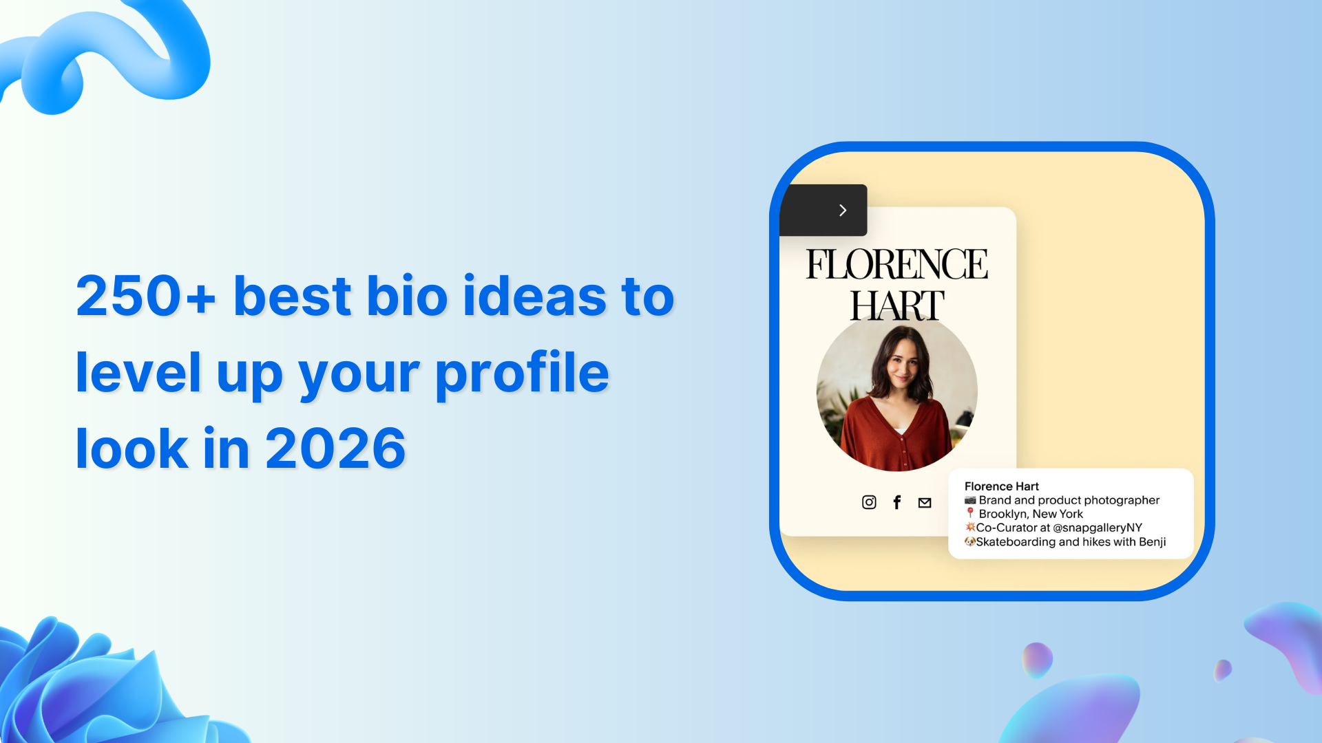
Also read: 250+ best bio ideas to level up your profile look in 2026
Summing up
As you can see, your Instagram bio is more than just a few words at the top of your profile. It’s a chance to make a great first impression, share who you are, and even drive real engagement or traffic.
From knowing what a bio actually is, to updating it on iPhone, Android, or desktop, and learning how to write one that truly connects with your audience, you now have all the tools you need to make yours stand out in 2026.
And here’s a pro tip!
If you’re serious about getting more out of your bio, give Replug a try today. It’s a reliable link management platform that lets you create branded short links in seconds and even build powerful bio links that bring everything you want followers to see into one place.
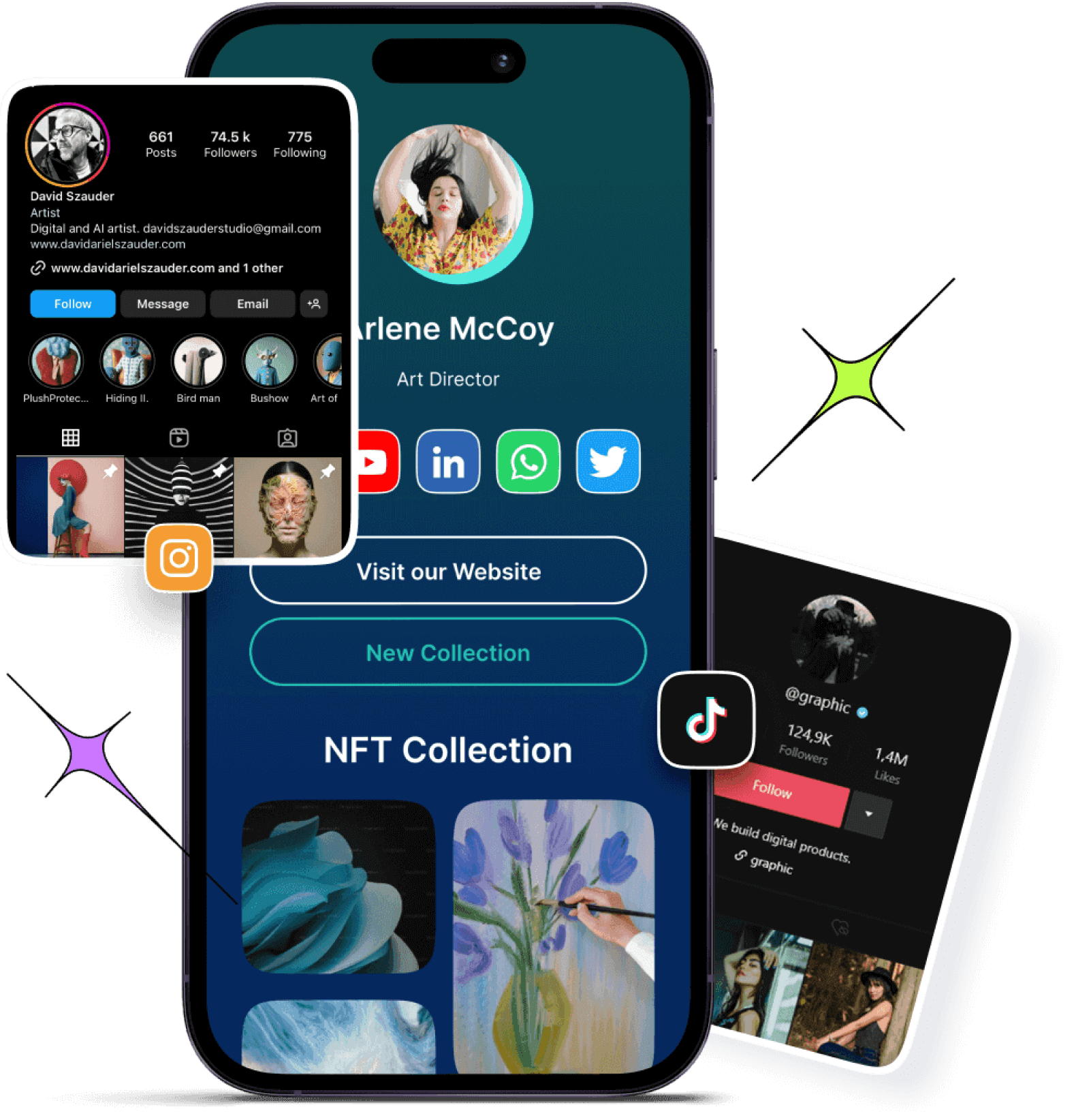
Also, don’t forget to check out Replug’s Instagram bio generator tool. It’s a great way to craft a standout bio with minimal effort!
Frequently asked questions
How do you edit your bio in Instagram in 2026?
To edit your Instagram bio in 2026, go to your profile in the Instagram app, tap Edit profile, then tap the Bio field. Next, delete the old text and add the new one. Finally, hit Done/Save or the checkmark (✓). Your updated bio will show right away! (The bio is still limited to 150 characters, so choose words wisely.)
How to change bio in Instagram in the new update?
Even with the newest Instagram updates, changing your bio works the same way. Just open your profile, tap Edit profile, select the Bio box, type your new bio, and save it. Instagram now also lets you add multiple links or update other profile details here.
How to change bio on Instagram Meta?
If by “Instagram Meta” you mean the official app by Meta (the company), it’s the same process. Open the Instagram app, go to your profile, tap Edit profile, select the Bio box, edit your bio text, and save. Meta doesn’t have a separate platform for bio edits outside the Instagram app.
How to set an Instagram bio easily?
Setting your Instagram bio is as simple as visiting your profile and tapping the Edit profile button. From there, find the Bio field, enter a short description (up to 150 characters), and tap Done or (✓) in the top right corner. You can also add emojis, keywords, and a link to make it more meaningful.
How do I get to my bio on Instagram?
To find your bio, open Instagram and go to your profile by tapping your profile icon (bottom right). Your bio appears right under your name and username. If you just want to edit it, tap the Edit profile button.
Where to find link in bio on Instagram?
The “link in bio” on Instagram is the clickable URL shown on a profile, right below the bio text and above the posts grid. That’s the single place Instagram lets you share an external link, like your website or a multi-link page.