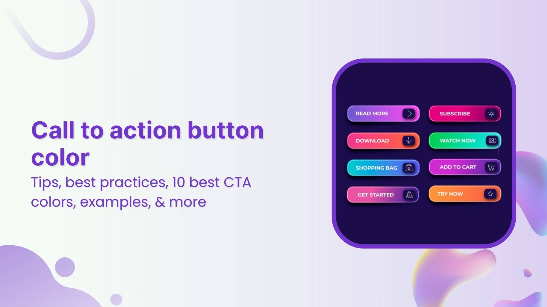
Your CTA might be the smallest element on the page, but it often drives the biggest results.
In fact, personalized CTAs can convert up to 202% better than generic ones, and many marketers report 10%+ conversion gains just from optimizing their calls to action. That’s huge for something that usually takes just a few words and a button.
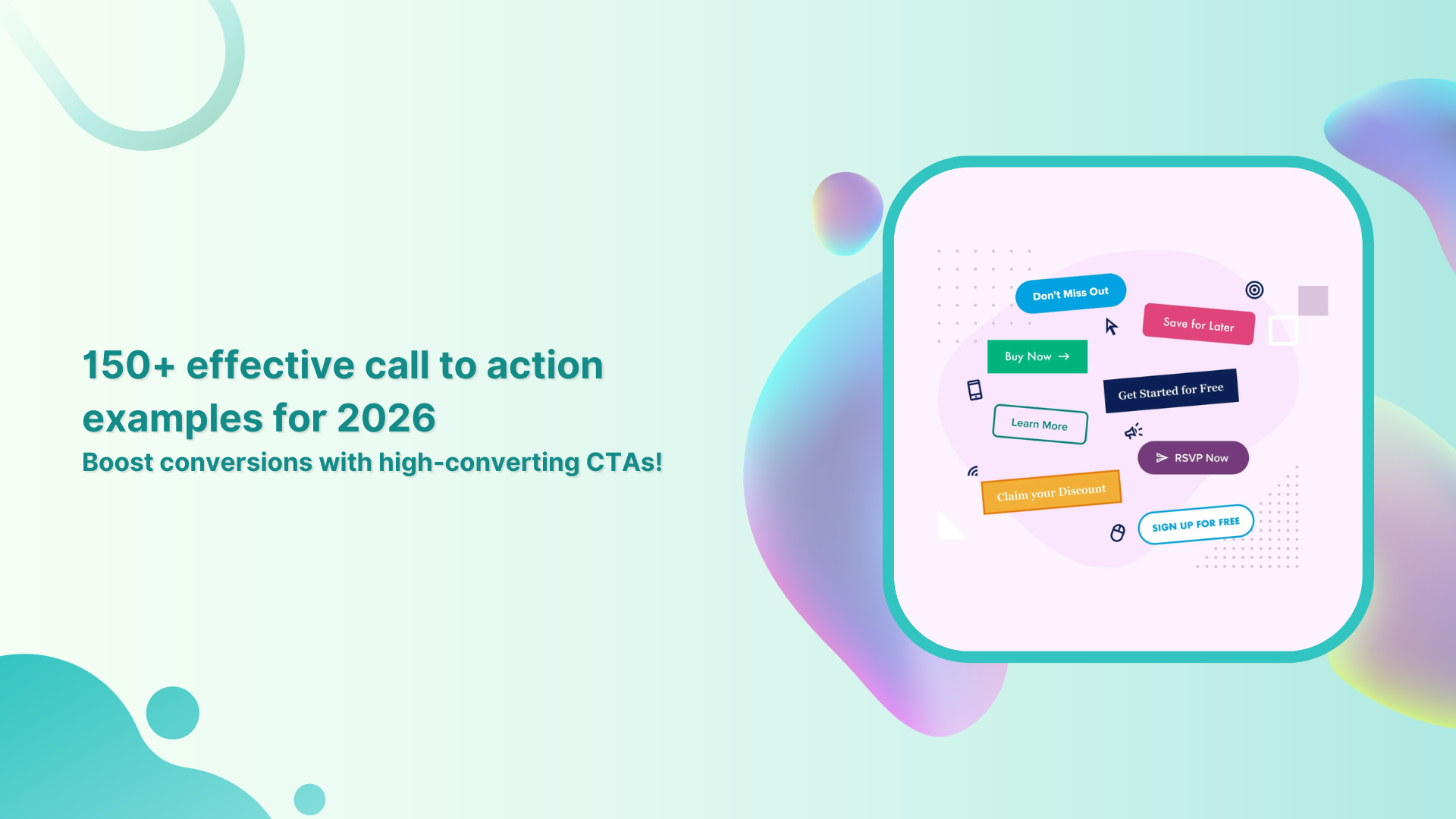
If you want more clicks, leads, and sales in 2026, your CTA strategy needs to work quite smartly. This guide packs 150+ high-converting call to action examples you can swipe and use right away.
But first, let’s quickly cover the basics, starting with what a call to action actually is!
What is a call to action (CTA)?
A “call to action (CTA)” is a short instruction in your marketing content that tells people exactly what step to take next, like “Buy now,” “Sign up,” or “Learn more.” Its job is simple but pretty powerful: move someone from passive interest to meaningful action.
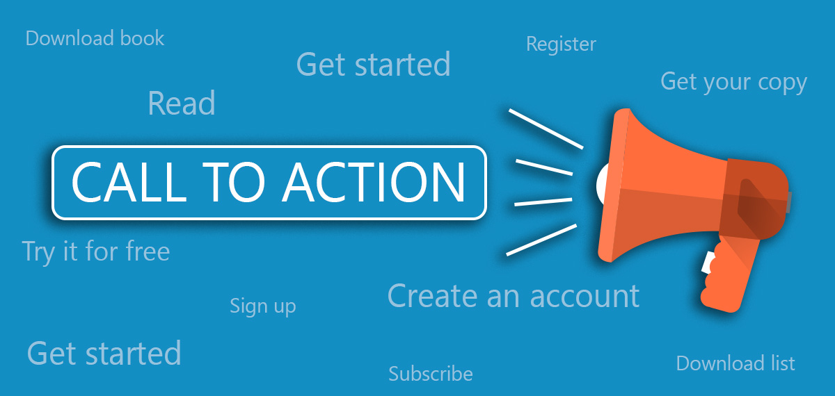
In digital marketing, CTAs usually appear as buttons, links, or short lines of persuasive copy. They act as the bridge between your message and your goal, whether that’s getting more clicks, leads, or sales.
Without a clear call to action, visitors often hesitate or leave without doing anything. In fact, studies show many users exit websites when no obvious next step is presented.
Primary objective or purpose of a CTA:
- Guide users toward the next step in the conversion journey
- Reduce confusion about what to do next
- Turn interest into measurable action (clicks, signups, purchases)
Why does a good CTA matter so much: Importance of a strong call to action!
A strong CTA isn’t just nice to have; it can make or break your conversions. Here’s why it matters:
- Drives real action: CTAs are designed to prompt immediate responses and move users from browsing to engaging.
- Clarifies the next step: A clear CTA removes guesswork so visitors know exactly what to do next.
- Boosts conversion rates: Personalized CTAs convert far better than generic ones.
- Prevents lost traffic: Many visitors leave without taking action when no clear CTA is visible.
- Improves user experience: Well-placed CTAs reduce friction and make navigation feel effortless.
- Creates urgency & motivation: Action-focused language encourages users to act sooner rather than later.
Up next, let’s explore the different examples of CTAs you can use to maximize results!
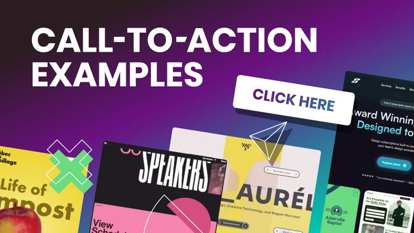
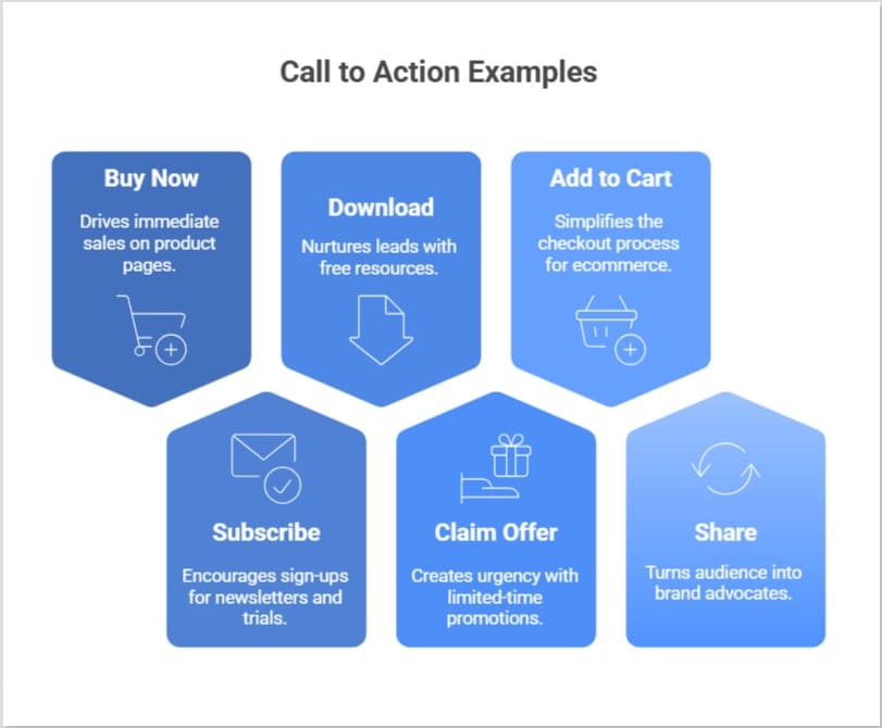
The ultimate list of proven call to action examples
Looking for CTAs that actually get clicks?
Below is a curated list of powerful CTA examples across different use cases, so you can quickly find inspiration that fits your goal and audience.
Good call to action examples
These are versatile, high-performing, good CTAs you can use almost anywhere (emails, blogs, ads, or popups).
- “Get your free guide now”: Used at the end of a blog post offering a downloadable checklist.
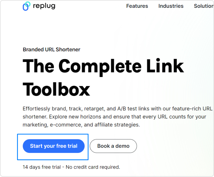
- “Start your free trial”: Placed on a homepage hero section to encourage sign-ups.
- “See how it works”: Used on a product page for visitors who are still researching.
- “Join thousands of happy users”: Added under social proof to build trust.
- “Claim your offer today”: Used in a limited-time promo banner to create urgency.
E-commerce call to action examples
In online stores, your CTA must push shoppers toward purchase without dissent. Here are strong call to action examples for e-commerce in action:
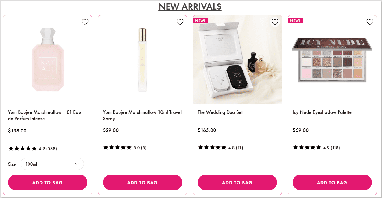
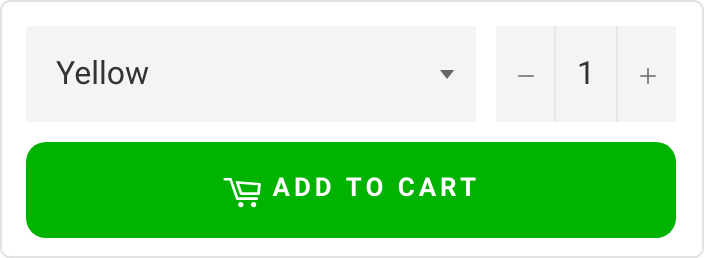
- “Add to cart”: On a product page, when a shopper selects size and color.
- “Buy now — only 3 left!”: Used during low-stock situations to trigger urgency.
- “Unlock 20% off”: Appears in an exit-intent popup for abandoning visitors.
- “Shop the collection”: Featured on a category banner for browsing shoppers.
- “Get yours before it’s gone”: Used in flash sale emails.
Marketing call to action examples
A strong CTA in marketing campaigns helps move leads smoothly through the funnel.
- “Download the full report”: Used in a LinkedIn lead-gen campaign.
- “Book your free consultation”: Placed on a service business landing page.
- “Reserve your spot”: Used in webinar promotion emails.
- “Get the marketing playbook”: Featured in a lead magnet pop-up.
- “Talk to an expert”: Used on B2B service pages for high-intent visitors.
SaaS call to action examples
For software companies, CTAs should reduce friction and quickly highlight value. These examples do exactly that:
- “Start free — no credit card required”: Used on SaaS homepages to lower risk.
- “Try the demo”: Placed near product feature sections.
- “Create your account now”: Used after explaining core benefits.
- “See the platform in action”: Embedded in product walkthrough pages.
- “Upgrade when you’re ready”: Used inside freemium dashboards.
Social & engagement call to action examples
These CTAs focus more on interaction, shares, and community growth rather than immediate sales.
- “Follow us for daily tips”: Used at the end of social posts.
- “Drop a comment below”: Encourages engagement on Instagram or LinkedIn.
- “Share this with a friend”: Used in viral content posts.
- “Tap the ❤️ if you agree”: Common in short-form social content.
- “Join the conversation”: Used in community-focused posts.
Website call to action examples
Always remember, your site needs clear direction points. These CTA examples for a website guide visitors smoothly.
- “Explore features”: Used in the main navigation hero section.
- “View pricing”: Placed for comparison-ready visitors.
- “Get started today”: Featured prominently above the fold.
- “Browse resources”: Used in knowledge hub sections.
- “Contact our team”: Positioned on service pages.
Landing page call to action examples
Landing pages live or die by their CTA. These CTA examples for landing pages are specifically built for conversions.
- “Yes — I want the free checklist”: Used on lead capture pages.
- “Show me the results”: Placed after benefit-driven copy.
- “Start my free trial”: Featured as the primary button.
- “Get instant access”: Used for gated content offers.
- “Claim my spot now”: Perfect for limited-seat webinars or events.
Social media call to action examples
These call to action examples for social media are designed to spark quick engagement, shares, and clicks across platforms.
- “Save this post so you don’t miss it later”: Used at the end of an educational carousel to boost saves.
- “Tag someone who needs this”: Added to a relatable meme to increase reach.
- “Vote in the poll and tell us why”: Used in Stories to drive interaction.
- “Swipe to see the full transformation”: Perfect for before-and-after posts.
- “Turn on notifications for daily tips”: Used by creators who post frequently.
Instagram call to action examples
These top-notch call to action examples for Instagram work especially well with captions, Stories, and Reels.
- “Double-tap if this helped you”: Used on quick tip Reels to boost engagement signals.
- “Link in bio for the full tutorial”: Common in educational or how-to posts.
- “Save this Reel for your next workout”: Used by fitness creators.
- “DM us ‘START’ to get the details”: Great for lead generation via DMs.
- “Comment ‘GUIDE’ and we’ll send it”: Used in growth-focused posts.
Facebook call to action examples
Facebook CTAs often work best when they feel community-driven and conversational.
- “Click ‘Learn More’ to see the full story”: Used in inspired posts.
- “Join our free Facebook group today”: Common for community building.
- “Mark yourself as ‘Going’ to save your seat”: Used on event pages.
- “Send us a message to get your quote”: Effective for service businesses.
- “Share this with your friends who’d love it”: Used to expand organic reach.
YouTube call to action examples
On YouTube, timing and clarity matter a lot. These CTAs help turn viewers into subscribers and leads.
- “Hit subscribe for weekly tutorials”: Delivered verbally near the intro or outro.
- “Watch the next video on your screen now”: Used with end screens.
- “Check the link in the description for the free resource”: Common in educational videos.
- “Comment your biggest challenge below”: Encourages engagement signals.
- “Turn on the bell icon so you don’t miss the next upload”: Used to boost notifications.
TikTok call to action examples
Short, punchy CTAs work best on TikTok. These high-quality call to action examples for TikTok match the platform’s fast pace, the best.
- “Follow for part 2”: Perfect for storytelling or series content.
- “Watch till the end for the surprise”: Helps increase retention.
- “Try this and tag us”: Great for challenges or product demos.
- “Drop a 🔥 if you agree”: Simple engagement booster.
- “Check our bio for the full guide”: Used to drive off-platform traffic.
WhatsApp call to action examples
WhatsApp CTAs should feel personal and low-pressure since the platform is more intimate.
- “Tap here to chat with us on WhatsApp”: Used on websites for instant support.
- “Reply YES to confirm your booking”: Common in appointment reminders.
- “Message us to get today’s price list”: Used by local businesses.
- “Join our WhatsApp updates list”: For broadcast or community growth.
- “Send your order details here”: Used in conversational commerce flows.
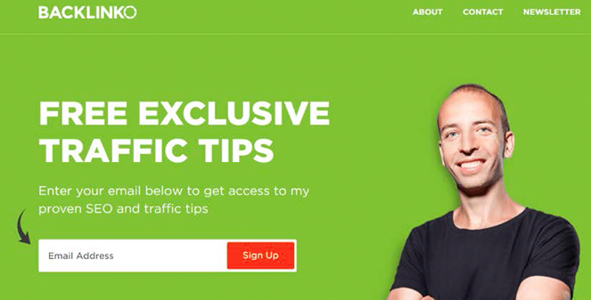
Email call to action examples
Email CTAs should be clear, benefit-focused, and easy to click on both desktop and mobile.
- “View your personalized recommendations”: Used in product recommendation emails.
- “Confirm your email to get started”: Sent right after account creation.
- “Access your free resource”: Placed in lead magnet delivery emails.
- “Update your preferences”: Used in re-engagement campaigns.
- “Finish your order in two clicks”: Added to abandoned cart emails.
Newsletters call to action examples
Newsletter CTAs should encourage readers to go more in-depth after scanning the email.
- “Read the full article”: Used after a short content teaser.
- “See this week’s top picks”: Great for curated newsletters.
- “Explore the full roundup”: Used in industry digest emails.
- “Catch up on what you missed”: Perfect for weekly recaps.
- “Discover more insights”: Used in thought-leadership newsletters.
Google ads call to action examples
Strong CTAs in Google Ads help capture high-intent search traffic quickly. Must use them wisely!
- “Get pricing instantly”: Used in search ads for service businesses.
- “Compare plans today”: Works well for SaaS and subscription offers.
- “Find your perfect match”: Used in product comparison ads.
- “Request your free quote”: Common in local service ads.
- “Order online in minutes”: Used for fast-checkout products.
Display ads call to action examples
Display ad CTAs must be short, punchy, and visually clear since attention is quite limited.
- “Reveal the deal”: Used in animated banner ads.
- “Grab the limited time offer”: Perfect for seasonal promos.
- “See what’s new”: Used in product launch banners.
- “Unlock member pricing”: Works well for loyalty programs.
- “Upgrade your setup”: Used in tech or software display ads.
Sign-ups & subscriptions call to action examples
These CTAs focus on reducing dissent and making commitment feel easy.
- “Create my free account”: Used on registration pages.
- “Join the insider list”: Common for email subscriptions.
- “Start my membership”: Used on paid community pages.
- “Get weekly tips in your inbox”: Great for blog subscriptions.
- “Become a member today”: Used on gated content sites.
Free trial call to action examples
Free trial CTAs work best when they remove risk and highlight immediate value.
- “Test drive the platform”: Used on SaaS feature pages.
- “Try it free for 14 days”: Placed near pricing tables.
- “Start exploring for free”: Used for freemium tools.
- “Experience premium features”: Used in upgrade prompts.
- “Begin your risk-free trial”: Featured on high-intent landing pages.
Membership call to action examples
Membership CTAs should highlight exclusivity and ongoing value to encourage commitment.
- “Unlock member-only perks”: Used on a pricing page for premium access.
- “Join the VIP community”: Featured on creator or brand websites.
- “Become a premium insider”: Used for paid content platforms.
- “Access exclusive benefits”: Placed near the membership comparison table.
- “Upgrade to premium access”: Used inside free user dashboards.
Digital product call to action examples
When selling digital goods, your CTA should emphasize instant value and easy access.
- “Download your copy instantly”: Used on an ebook sales page.
- “Get the template bundle”: Featured on a creator storefront.
- “Access the full course now”: Used on online course landing pages.
- “Unlock the complete toolkit”: Placed under product previews.
- “Grab the digital pack”: Used in limited-time creator promos.
App downloads call to action examples
App CTAs work best when they promise speed, convenience, or immediate benefit.
- “Download the app and get started”: Used on mobile-focused landing pages.
- “Install in seconds”: Featured in mobile ads.
- “Get the app for smarter tracking”: Used by productivity tools.
- “Open in the app for full features”: Used on mobile web prompts.
- “Take it with you — download now”: Used in cross-device campaigns.
Survey call to action examples
Survey CTAs should feel swift, low-effort, and valuable to the user.
- “Share your feedback with us”: Used in post-purchase emails.
- “Tell us what you think”: Placed in customer experience surveys.
- “Take the quick survey”: Used in in-app prompts.
- “Help us improve your experience”: Featured after support interactions.
- “Rate your experience today”: Used in service follow-ups.
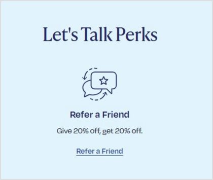
Referral call to action examples
Referral CTAs should clearly communicate the reward and make sharing as easy as possible.
- “Invite friends and earn rewards”: Used in referral dashboards.
- “Give $20, get $10 back”: Featured in customer loyalty emails.
- “Share your link to start earning”: Used in affiliate programs.
- “Refer a friend today”: Placed in post-purchase flows.
- “Send an invite in one click”: Used in app referral screens.
Urgency-based call to action examples
Urgency CTAs create momentum by encouraging users to act right now.
- “Claim your bonus before midnight”: Used in limited-time promos.
- “Secure your spot today”: Featured in event registrations.
- “Don’t miss this drop”: Used in product launch campaigns.
- “Last chance to save”: Placed in countdown emails.
- “Act now — offer ending soon”: Used in retargeting ads.
Upsell call to action examples
Upsell CTAs should feel helpful (not pushy) by clearly showing the added value of upgrading.
- “Add premium features to your plan”: Used inside the checkout flow.
- “Upgrade for more power/features”: Placed in freemium dashboards.
- “Complete your setup with this add-on”: Used on post-purchase pages.
- “Go Pro for advanced tools”: Featured in feature-locked areas.
- “Enhance your order in one click”: Used in cart upsell popups.
Webinar call to action examples
Webinar CTAs should highlight learning value and time sensitivity perfectly.
- “Save my seat”: Used on webinar registration pages.
- “Register for the live training”: Featured in promo emails.
- “Join the free masterclass”: Used in social promotions.
- “Reserve your webinar spot”: Placed on landing pages.
- “Attend the live session”: Used in reminder campaigns.
Lead generation/content call to action examples
These CTAs focus on capturing leads by offering helpful content in return.
- “Get your free checklist”: Used in blog content upgrades.
- “Download the case study”: Featured on B2B pages.
- “Unlock the full guide”: Used in gated resource hubs.
- “Send me the PDF”: Used in inline blog forms.
- “Access the resource library”: Placed on content hubs.
Call to action examples for business
These versatile CTA examples for business help companies drive inquiries, sales, and engagement seamlessly.
- “Request a custom quote”: Used on service business websites.
- “Schedule your consultation”: Featured on professional service pages.
- “Work with our team”: Used on agency homepages.
- “Check availability now”: Common for booking-based businesses.
- “Start your project with us”: Used on creative agency sites.
Call to action examples in conversion optimization
In CRO, CTAs are tested and refined to remove friction and maximize clicks.
- “Show me my results”: Used after interactive tools or quizzes.
- “Continue to secure checkout”: Used in optimized cart flows.
- “Reveal my savings”: Used in pricing calculators.
- “See personalized pricing”: Featured after user input.
- “Complete my setup”: Used in onboarding flows.
Call to action examples to encourage action
These CTAs are built solely to drive immediate action.
- “Take the next step”: Used at the end of educational content.
- “Make your move today”: Featured in motivational campaigns.
- “Start making progress”: Used in productivity tools.
- “Jump in and explore”: Used on interactive platforms.
- “Let’s get you started”: Used in welcome screens.
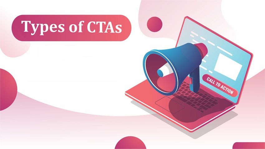
Types of CTAs with examples
A call to action, or in simple words, a CTA, guides users toward the next step you want them to take intentionally.
Different types of CTAs serve different goals. Some drive sales, others build engagement or collect leads, etc.
Primary CTAs
Primary CTAs are your main drivers of conversion. They highlight the single most important action you want users to take on a page, so they’re usually bold and highly visible.
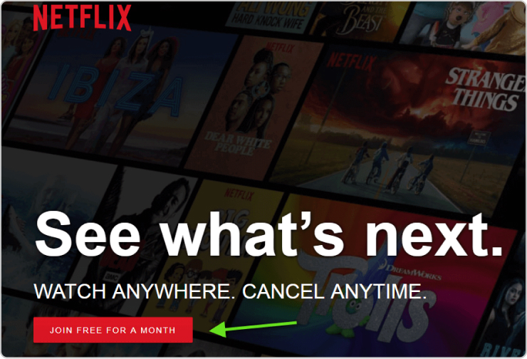
Example: 👉 “Start your free trial” on a SaaS homepage.
Secondary CTAs
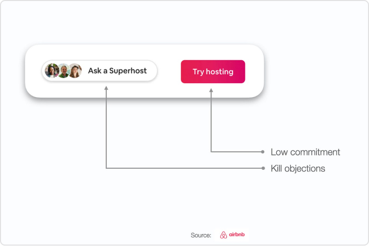
Secondary CTAs support the primary one by offering a softer or alternative action. They’re helpful for visitors who aren’t ready to commit yet.
Example: 👉 “Learn more” placed next to a primary “Buy now” button.
Direct-action CTAs
Direct-action CTAs prompt users to take an immediate, specific step. They use strong action verbs and create a sense of urgency.
Example: 👉 “Download the guide now” on a resource landing page.
Informational CTAs
Informational CTAs help users explore and learn more before making a decision. They’re common in blog posts and educational content.
Example: 👉 “Read the full case study” at the end of an article.
Social sharing CTAs
Social sharing CTAs encourage users to share your content on social media, helping you expand reach and visibility organically.
Example: 👉 “Share this post on LinkedIn” below a blog article.
Personalized CTAs
Personalized CTAs are tailored based on user behavior, location, or preferences. They feel more relevant and often convert better.
Example: 👉 “Welcome back! Continue your course” for returning users.
Lead nurturing CTAs
Lead nurturing CTAs move prospects further down the funnel without pushing for an immediate sale. They focus on building trust and relationships.
Example: 👉 “Get our weekly marketing tips” on a newsletter signup form.
Purchase/sales CTAs
Sales CTAs are designed solely to drive revenue. They appear when users are close to making a purchase and clearly signal the buy action.
Example: 👉 “Add to cart” on an e-commerce product page.
Event/promotion CTAs
Event or promotional CTAs highlight time-sensitive offers, launches, or special campaigns. They often include urgency words.
Example: 👉 “Register for the webinar, limited seats only!” or “Claim your 30% discount today.”
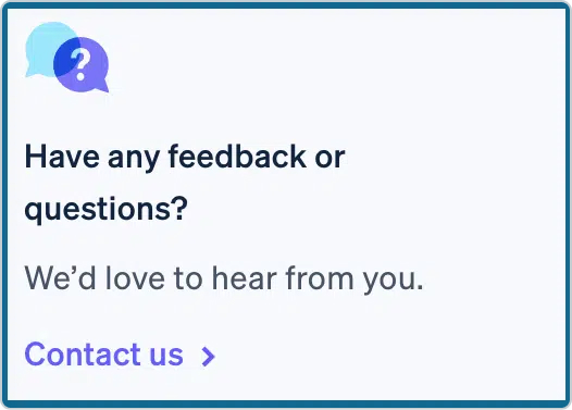
Feedback/support CTAs
Feedback or support CTAs invite users to share their opinion or get instant help. They improve the customer experience and show that support is readily available.
Example: 👉 “Contact support” in a help center or “Rate your experience” after a purchase.
How to write an effective CTA: Useful tips to keep in mind
If you’re wondering how to create a call to action that actually gets clicks, it all comes down to clarity, value, and smart placement.
Below are practical tips you can use right away to make your CTAs more compelling and effective.

Tip #01: Use action-oriented, clear language
Your CTA should clearly tell people exactly what to do (no guessing required). Strong verbs make your message feel direct and easy to follow.
Avoid vague phrases that leave users confused. Keep it short, specific, and focused on one action.
Quick example:
👉 “Download your free checklist” (clear and action-driven)
❌ “Click here” (too generic)
Tip #02: Focus on value & benefit
People don’t click buttons; they click benefits. Instead of describing the action, highlight what the user actually gains. This makes your CTA feel helpful rather than pushy.
Think from the reader’s perspective: What’s in it for me?
Quick examples:
👉 “Get 20% discount on your first order.”
👉 “Refer a friend and get 5% additional bonus!”
These work better because the benefit is pretty obvious!
Tip #03: Create urgency & scarcity
When users feel they might miss out (FOMO), they’re more likely to act quickly. Adding urgency or limited availability can significantly improve conversions, but keep it honest and realistic.
Use time limits, limited spots, or countdown-style wording.
Quick examples:
👉 “Claim your spot now — only 5 seats left.”
👉 “Offer valid till midnight. Avail now!”
Just don’t overdo it, since fake urgency can seriously hurt trust!
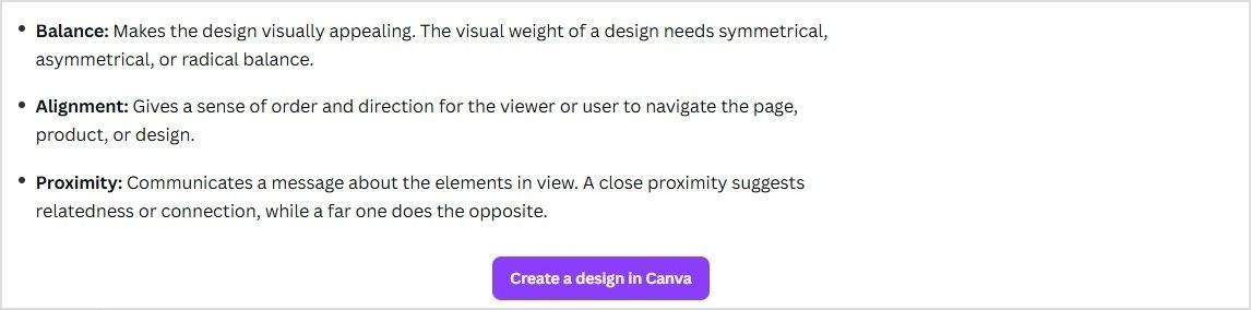
Tip #04: Optimize design & placement
Even the best wording won’t work if your CTA is hard to find. Your button or link should stand out visually and appear exactly where users expect it.
Key things to watch:
- Use contrasting colors
- Make the button large enough to notice
- Add enough white space around it
- Place CTAs above the fold and at natural stopping points
Quick example:
👉 A bright, high-contrast button (e.g., “Buy Now!”) right after product benefits usually performs better than a small text link seeded at the bottom.
Tip #05: Personalize & test
There’s no single perfect CTA. What works for one audience may flop for another. However, personalization and regular testing help you continuously improve performance.
Try:
- Using the user’s stage or behavior
- Segment-based messaging
- A/B testing different wording, colors, or placements
Quick example:
👉 New visitors: “Explore features.”
👉 Returning users: “Continue where you left off.”
Small tweaks can lead to surprisingly big gains over time!
Best practices for high-converting CTAs
If you want more clicks and conversions, your CTA needs more than just a nice button. These proven, most promising practices will help you create calls to action that actually get people to act.
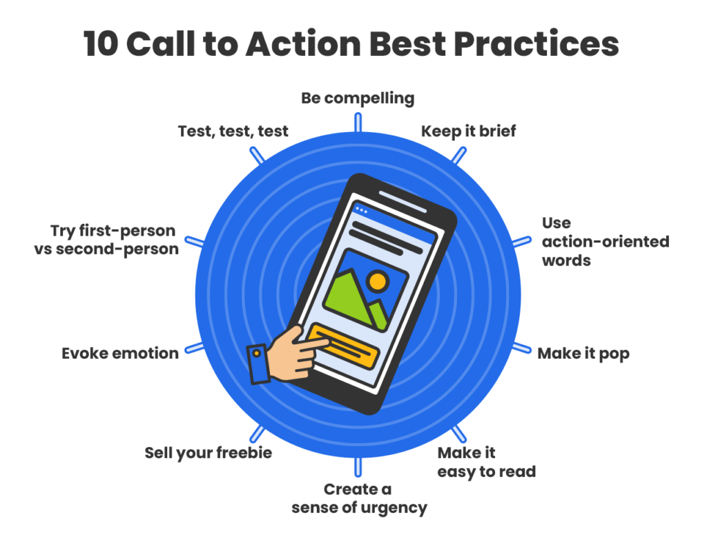
Keep it simple & concise
Your CTA should be instantly clear. If someone has to think about what happens next, you’ve already lost momentum. Short, direct wording works best!
Example:
Instead of: “Click here to proceed with your free trial registration process”
Use: “Start Free Trial”
Use high-contrast design
Your CTA must stand out visually from the rest of the page. High-contrast colors and ample white space help users spot the button quickly.
Example:
If your page is mostly white and blue, use a bold orange or green button with text like: “Get Started”
Use action verbs
Strong action verbs create a steady flow and tell users exactly what to do. Weak or passive language reduces clicks.
Example:
Instead of: “More information”
Use: “Download the Guide”
Align with intent
Match your CTA with where the user is in their journey. Someone reading a blog post isn’t always ready to buy, and that’s okay.
Example:
- Top of funnel: “Read the Full Guide”
- Mid funnel: “Compare Plans”
- Bottom of funnel: “Buy Now”
Build trust (use social proof)
Most people hesitate when they’re unsure about something. Adding proof near your CTA reduces conflict and uplifts confidence.
Example:
CTA button: “Register Now”
Under it: “Trusted by 50,000+ marketers.”
Make it irresistible
Give users a clear reason to click your CTA. Highlight what they gain, not just what they do.
Example:
Instead of: “Sign up”
Use: “Get Your Free Marketing Toolkit”
Why it works: Because it feels personal and benefit-driven.
Create urgency
Urgency pushes people to act now rather than later (often meaning never). Honesty use time limits or limited availability.
Example:
“Claim Your 30% Discount — Offer Ends Tonight”
Highlight value
Your CTA should answer the user’s silent question: “What’s in it for me?” Make the benefit quite obvious.
Example:
Instead of: “Subscribe”
Use: “Get Weekly Growth Tips”
Limit choices
Too many CTAs on one screen create decision fatigue. Guide users toward one primary action whenever possible. Its the best practice!
Example:
Good: One main button, like “Start Free Trial”
Not ideal: Five competing buttons in the same section.
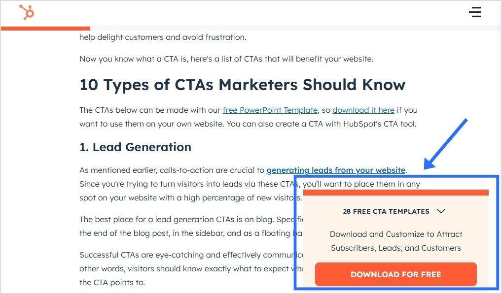
Strategic placement matters
Even the best CTA can fail if it’s placed incorrectly. Position CTAs where users naturally decide to take action.
High-performing placements:
- Above the fold
- After key benefits
- At the end of the blog posts
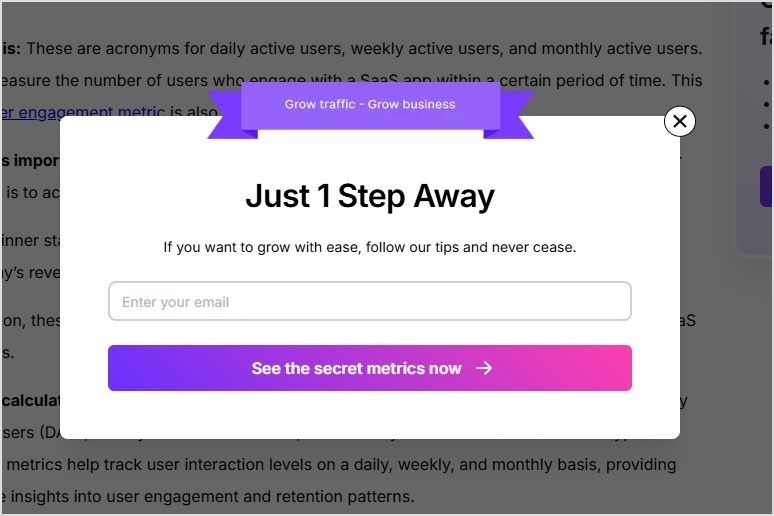
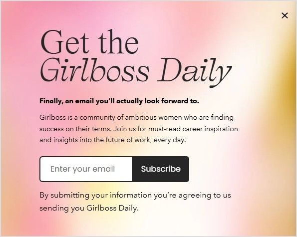
- Inside sticky headers or popups (used carefully)
Example:
After explaining product benefits, place: “Try It Risk-Free”
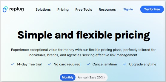
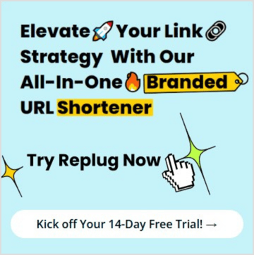
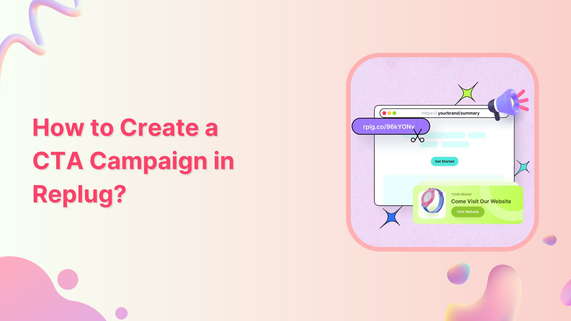
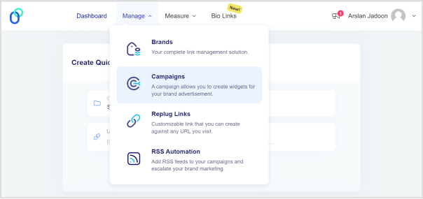
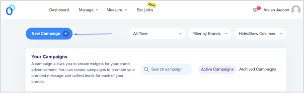
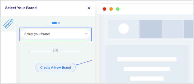
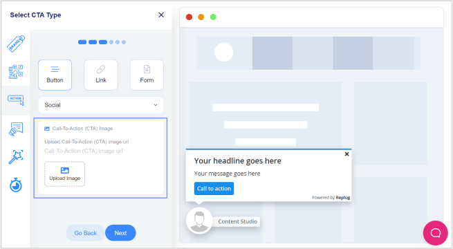
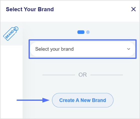
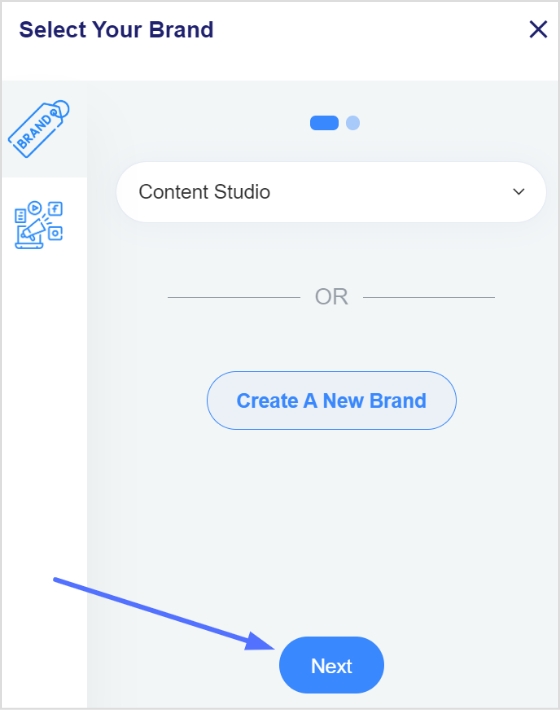
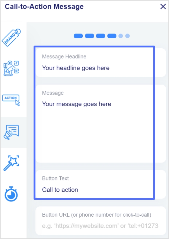
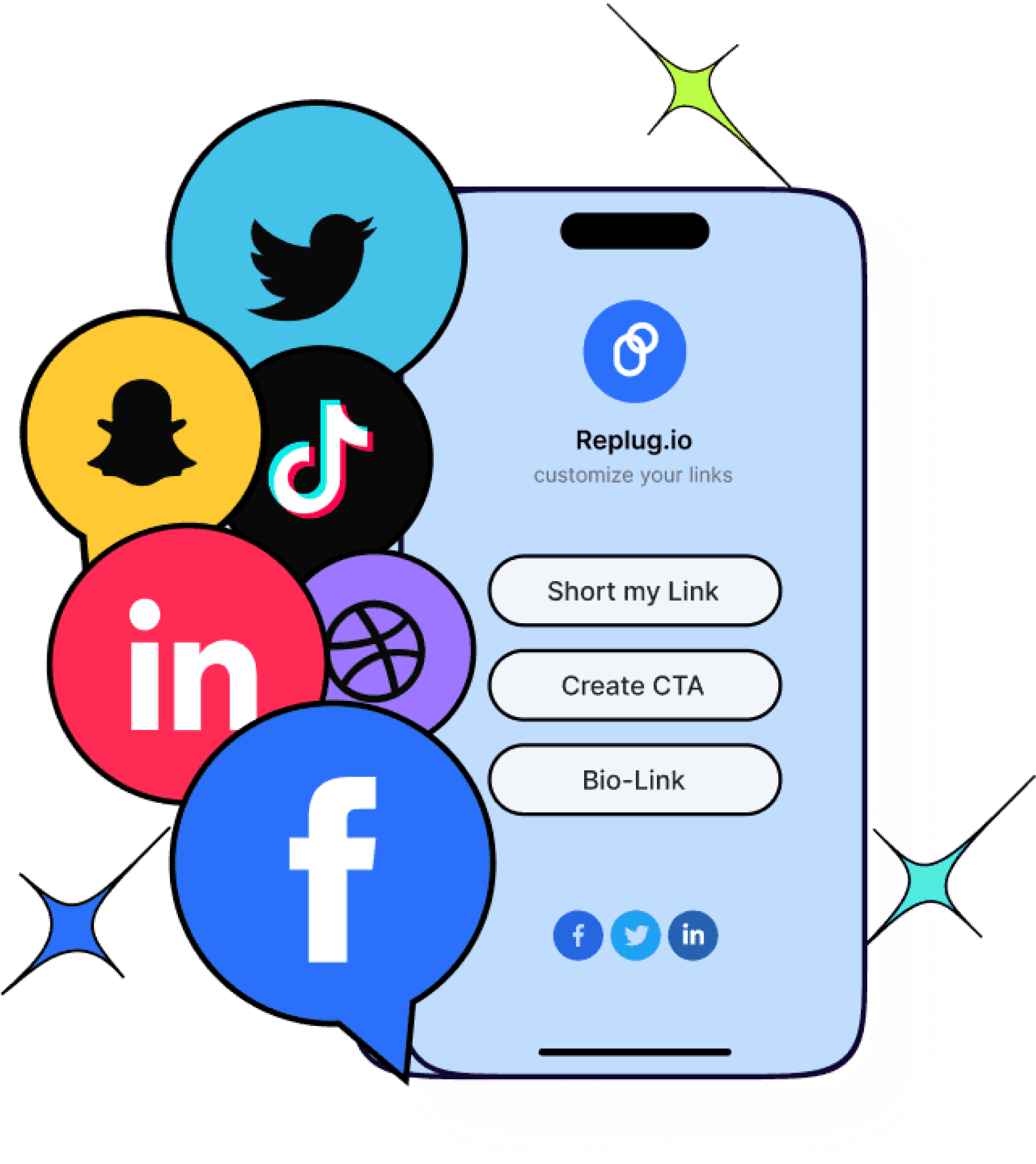
Generate compelling CTAs with Replug today!
If you wish to create CTAs that actually get clicks, Replug makes the process simple and effective.
It’s an all-in-one link management platform designed to help marketers, creators, and businesses optimize their links, track performance, and boost conversions from a single dashboard.
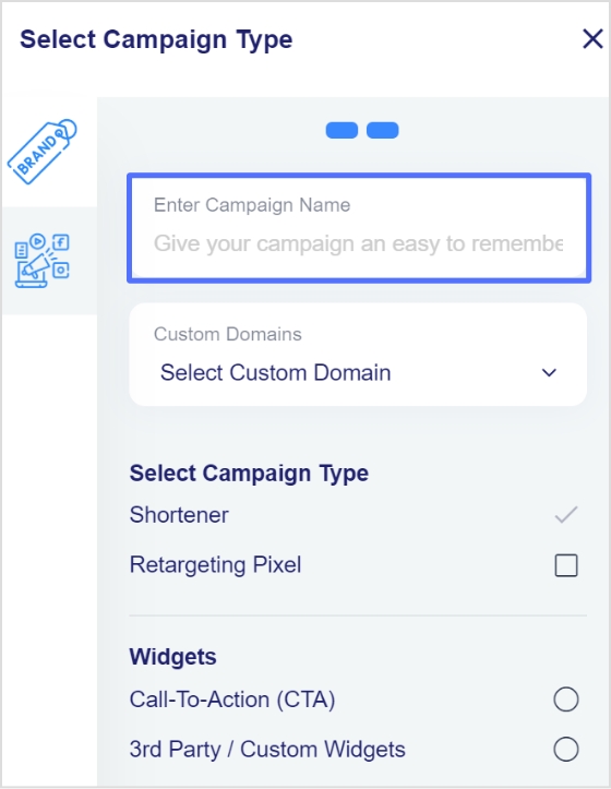
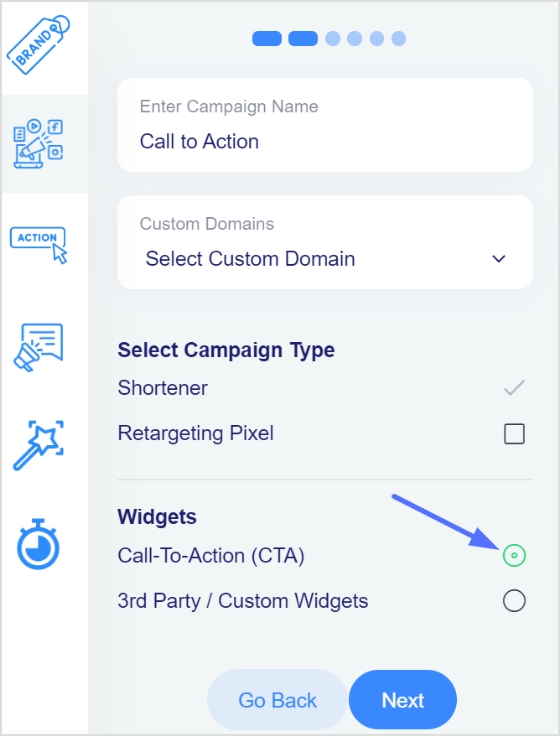
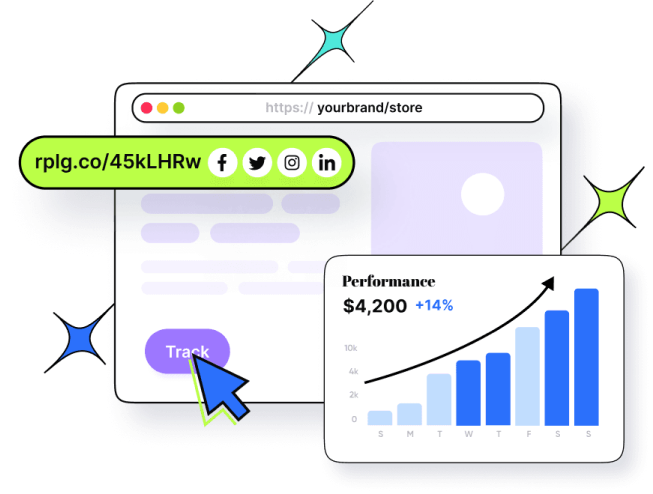
With Replug, you’re not just shortening URLs, you’re turning every link into a conversion opportunity. The platform offers powerful features like branded short links, bio-link pages, retargeting pixels, and detailed analytics to help you understand what’s working and what’s not.
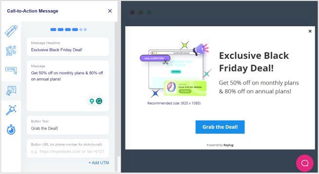
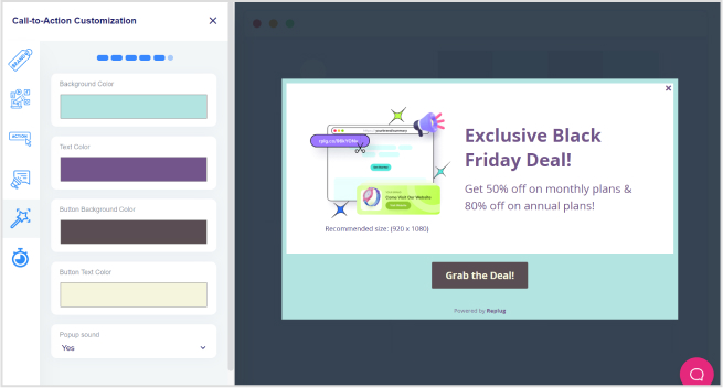
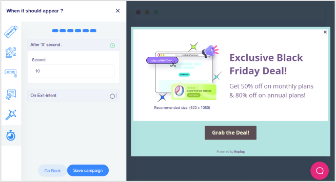
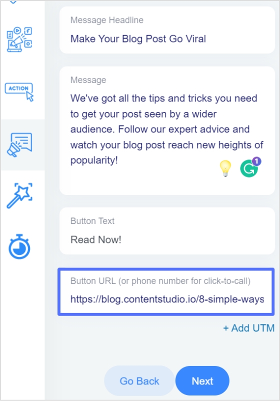
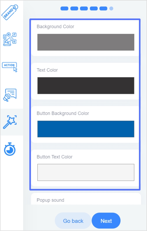
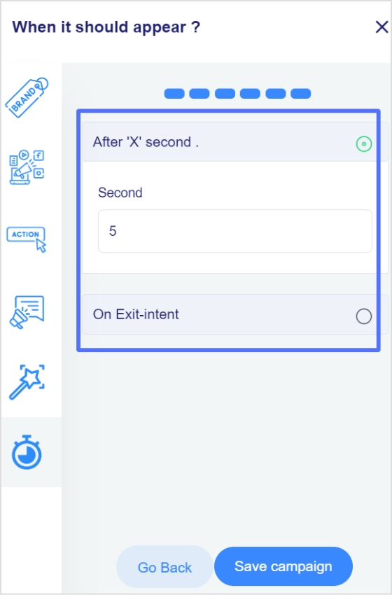
What really stands out is Replug’s built-in call to action generator. It can quickly create multiple CTA variations that match your brand voice, saving you time and creative effort.
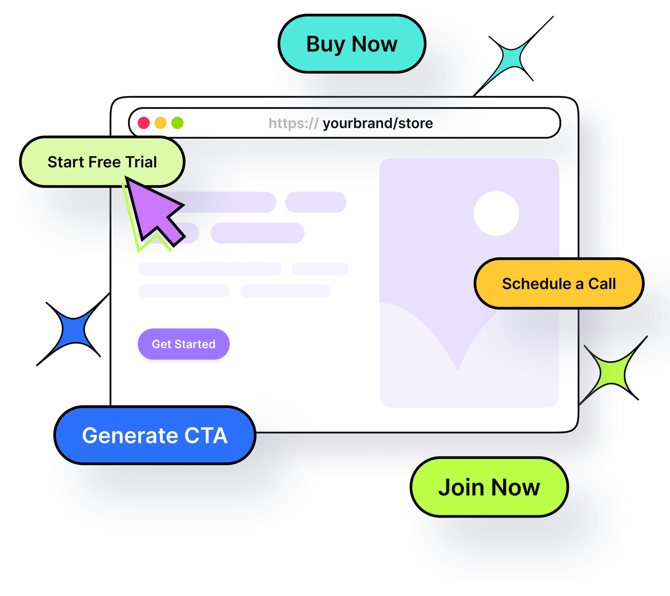
You can also customize CTA buttons, banners, or pop-ups, control their placement, and even run A/B tests to find your best-performing message.
In short, if you’re serious about improving clicks, leads, and ROI, Replug gives you everything you need in one place. This includes one of the most practical and easy-to-use call to action generators available today!
Summing up
A strong CTA isn’t just a button; it’s the ultimate bridge between your content and real results.
From understanding different CTA types to learning numerous examples, proven tips, and best practices, you now know what it takes to write CTAs that actually get clicks and conversions. The key is to keep things clear, value-driven, and aligned with what your audience wants.
If you want to speed things up, using a smart free CTA generator can make the process much easier. Tools like Replug help you create, test, and optimize CTAs without the guesswork.
Start experimenting, keep testing what works for your audience, and you’ll see your conversions move in the right direction. 🚀
Frequently asked questions
What is an inspiring call to action?
An inspiring call to action (CTA) is a short prompt that motivates people to take the next step by appealing to their emotions or aspirations. It goes beyond simple commands and connects to value, like “Start your journey today” or “Unlock your potential now.” An inspiring CTA feels more like encouragement than a sales pitch.
What is a good call to action sentence?
A good CTA sentence is short, specific, and tells the reader exactly what to do and what they get.
For example:
–“Download your free guide today”
–“Start your free trial now”
–“Join thousands of learners and grow your skills.”
These use action verbs and promise immense value!
When and how to use a call to action?
Use a CTA whenever you want someone to take a clear next step, like signing up, buying, downloading, subscribing, or sharing. Place it at a point where users are ready to act (after useful information, at the end of an article, in an email, on a landing page). Use action verbs, keep the message clear, and explicitly explain the benefit.
Where should I place my CTAs on my website?
Your CTAs should be easy to see, and in places users naturally look:
– Above the fold (first thing people see)
– Homepage hero section
– Within the content (after key points in articles)
– End of pages (after engagement)
– Navigation bar or footer for consistent access
You can repeat CTAs on long pages, but make sure not to clutter the page.
What are calls to action for social media?
On social media, CTAs are short prompts encouraging specific actions, such as:
–“Follow for more tips”
–“Like and share this post”
–“Comment your thoughts”
–“Save this for later”
They should fit the platform style and audience behaviour optimally.
How to write an effective CTA for social media in 2026?
To write effective social media CTAs in 2026:
1. Start with a strong action verb like Get, Try, Share, or Save.
2. Include a clear benefit so people know what they gain.
3. Keep it short and natural for the platform and audience.
4. Add urgency only when real (“Limited time only”).
5. Match the CTA to the content so it feels relevant and helpful.
Example: “Save this tip and follow for more daily strategies!”
Provide a list of CTA examples that combine strong copy with good design?
Examples where the words and visuals work together to drive action:
–“Fill your calendar with appointments ➜ Get my free planner”: Clear value + strong visual cue.
–“Take the test in 30s ➜ Start now”: Communicates speed and invites action.
–“Shop best-sellers ➜ View collection”: Direct invite with clear purpose.
–“Try Dwell+ for FREE ➜ Start your trial”: Big benefit + contrasting design.
–“Get Free CRM ➜ Start using today”: Simple benefit + standout button color.
These examples show strong action words matched with visible, contrast-boosting design.
What are some of the best CTA examples that use the rule of threes?
The rule of threes means the CTA follows a structure like action + benefit + urgency.
Examples:
–“Start Free Trial + No Credit Card + Limited Seats”: Action, benefit, urgency.
–“Get Your Free Guide + Instant Access + Today Only”: Direct benefits + time-based prompt.
–“Join the Community + Learn More + Sign Up Now”: Action + value + prompt to act.
This structure helps messages stick and gives clarity on next steps.
Why CTA buttons matter so much and how to use them effectively?
CTA buttons matter a lot because they’re where users take the action you want, such as signing up, buying, or subscribing, etc. If they blend in or are unclear, users simply won’t click.
To use them effectively, focus on the call-to-action button’s color and contrast so it clearly stands out from the page background. Plus, use clear, benefit-focused words, and place them where users naturally stop and decide.
Strong CTA buttons that are visible, in a contrasting color, and paired with compelling copy drive significantly more clicks and conversions.
Provide CTA design best practices & tips?
Quick, practical design tips:
– Use contrast: The button’s color should stand out clearly from background elements so users notice it right away.
– Solid buttons are better: Filled buttons usually convert more than outline-only “ghost” buttons.
– Give breathing room: Surround CTAs with whitespace to prevent them from getting lost in the layout.
– Size matters: Bigger (but not overwhelming) buttons are easier to spot and click.
– Use hover effects: Small changes when hovering can draw attention and signal interactivity.
These practices make the CTA both noticeable and inviting.
What are the common mistakes to avoid when writing your CTA?
Sidestep these common mistakes:
– Generic text: Words like “Click Here” or “Submit” don’t tell users why they should act.
– Misaligned messaging: If the CTA doesn’t match the content or offer, users drop off.
– Poor placement: Hidden or low-visibility CTAs get ignored.
– No urgency or benefit: Weak language fails to inspire action.
– Too many CTAs: Too many buttons in one place confuse users and reduce focus.
Avoiding these pitfalls helps your CTAs convert better.
How can I measure my CTAs performance?
To measure your CTAs performance, track key metrics that show how users engage with them. Start by monitoring click-through rates (the number of people who clicked your CTA relative to views) and conversion rates (the number of people who completed the desired action after clicking).
You can use tools like Google Analytics, Usermaven, heatmaps, and built-in analytics in marketing platforms to test the effectiveness of your CTAs. A/B test different versions and compare clicks, placements, designs, and wording to see which converts best. These metrics give you clear insight into what’s working and where to improve.
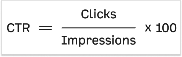
What is a CTA click rate, and how to measure it?
A CTA click rate (often called click-through rate or CTR) is the percentage of people who click on your call to action after seeing it. You calculate it by dividing the number of clicks by the number of times the CTA was viewed, then multiplying by 100.
For example, if 1,000 people saw a button and 50 clicked it, the click rate is 5%.
You can also measure it using analytics tools or call-to-action tools (such as analytics dashboards or conversion-tracking features) that record how often your CTAs are shown and clicked.
Why are CTAs important in marketing?
CTAs are important in marketing because they guide your audience toward specific actions and make your marketing efforts measurable. A good CTA turns passive viewers into active participants, whether signing up, buying, or downloading content.
In a CTA campaign, compelling call to actions help clarify what you want users to do next, improve conversion rates, and give you clear data (like clicks and conversions) to judge how well your campaign is performing. Without CTAs, users might enjoy your content but never take the step you actually want them to take.
How does a call to action influence consumer behavior?
A call to action influences consumer behavior by giving people a clear next step and reducing uncertainty about what to do.
CTAs can create urgency (e.g., “Limited offer”), highlight benefits (e.g., discounts or freebies), and tap into psychological triggers such as the fear of missing out. This makes people more likely to act quickly rather than delay decisions.
They simplify decision-making and guide consumers toward conversion by focusing their attention on a specific action.
How to decide which type of call-to-action phrase to use?
Determining which type of call-to-action phrase to use depends on a few key deciding factors:
– Your specific goal (buy, sign up, learn),
– Where your audience is in the buying journey, and
– What outcome do you want?
If your audience is still exploring, softer call-to-action phrases like “Learn More” may work better. If they’re ready to commit, stronger phrases like “Buy Now” or “Start Free Trial” make sense.
You also want to match the CTA phrase to the benefit you’re offering and keep it clear, direct, and relevant to the user’s intent. Testing different call-to-action phrases in your content will help you find what resonates best!


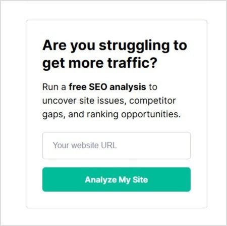
![Call-to-action overlays: Types, tips & templates [+ examples]](https://internal-blog.replug.io/wp-content/uploads/2025/07/What-is-a-call-to-action-overlay.jpg)

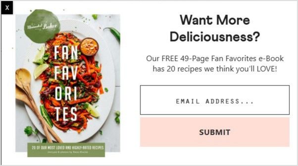
![100+ call-to-action phrases you NEED to use [+ best examples]](https://internal-blog.replug.io/wp-content/uploads/2022/09/call-to-action-phrases-1.jpg)